
More colour and more joy! Unagru debates colour in architecture.
- Lucrezia di Martino
- Mar 26, 2022
- 9 min read
Updated: Mar 11, 2025
"...Colour is one of the oldest architectural design elements – colourless architecture does not exist."

“I sympathise with Gropius who when asked his favourite colour, replied, “All of them!” People are frightened about choosing the ‘right’ ones, but I don’t worry about following rules… if a colour is beautiful, it will go with another beautiful colour.” – Richard Rogers, 2013.
We love bold colours, but we notice many people seem afraid to use them. In this article we look to understand why this might be, and what colour means to us all. This blog post is primarily focused on colour used in architectural and interior design to convey certain moods or create atmospheres, and to reflect the personality of the user.
At The Spider we used a deep red to highlight a new three-legged steel structure (hence the project’s name..) that allowed to unify space. The steel structure was was really the centre piece of the intervention: the aim was to keep a trace of the previous layout - three separate rooms - by setting the new structure well below the ceiling and then modelling three different ceiling shapes. The red element jumps out immediately and declares the project's intentions; while it also draws attention to the three ceilings. A visitor asks a questions and the narration begins. The design also partially incorporated an old fireplace; this time the trace was almost disappearing,in the joinery. We paint the surround a bright yellow (including part of the kitchen joinery); the client then added a stove and the fireplace gained a whole new character. The only element shifting across the original rooms os the kitchen island, for which we chose a very deep green, complementary to the red. We had in mind Matisse, and the Fauves and Van Gogh. Finally, the client chose beautiful North African tiles for the kitchen and green house areas, with complementary dark green and red tones. The result is a joiyful twist on a very subtle form of intervention. The red posts are more approachable, and soon full of magnets, childrens' drawings and photographs. Even more colour.
We picked a bright yellow for the ceiling and wall paint in the entrance of The Boat & Pavilion. We chose the colour specifically so that the natural North light would reflect off the wall and ceiling to create a warmer atmosphere. Moving deeper into the service area (just one door away), everything is painted in a dark blue, like an underwater world: after all, it’s a house for sailors, yellow sun and blue water are familiar references.
At the Peckham Glass Box, our client Helen chose a rich Cobalt blue to create focal points in the large open plan kitchen. The colour is particularly striking within the glass box itself, surrounded by the sky and the garden.


Spider (left), The Boat & Pavilion (middle), Peckham Glass Box (right).
Now, we wouldn’t be boring humanists if we didn’t try to show off a little with the theory of colour, the origin of primary colours and its relationship to the educational and practical context of architecture. If you have a social life you might want to skip ahead.
Theory of colour
“To Goethe, the theory was the result of mistaking an incidental result for an elemental principle. Far from pretending to a knowledge of physics, he insisted that such knowledge was an actual hindrance to understanding. He based his conclusions exclusively upon exhaustive personal observation of the phenomena of colour.” (Kardinata, 2014)
The most significant debate around colour was carried out by Sir Isaac Newton and Johann Wolfgang von Goethe, from the scientific and artistic points of view respectively, “while the theory of Newton and his successors was based on excluding the colour-seeing faculty of the eye, Goethe founded his theory on the eye’s experience of colour” (Lehrs, 2014). What draws the common point between the two is the respect of light as the source of colours, where light is the key ingredient in animating architectural spaces.

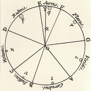


To the left, a coulour wheel attributed to Newton in 1704 (Jones, 2017). This was a result of Newton's experiments with prism and beams of sunlight. Newton demonstrated that “different light wavelengths are combined to create different colours, and when added together the result is white light.” (Clair, 2018)
Middle, Newton’s colour wheel as further elaborated by Moses Harris. (Jones, 2017)
Right, Goethe’s colour wheel dissects the pie-chart wheel into 6 colours symmetrically, with a belief that “colour itself is a degree of darkness” (Jones, 2017), rejected Netwon’s statement of “darkness as an absence of light”.
Primary colours
“Colour can be used strategically to orchestrate spatial sequences or to visualise tectonics, it can support light and shadow, make surfaces an optical and haptic experience and much more. Colour is one of the oldest architectural design elements – colourless architecture does not exist.” – Steffanie Wettstein, n.a
Newton’s description of primary colours as “coloured spectral components of sunlight” inspired the different arguments that narrow primary colours into three, by the prominent contributors of “modern colour science” (Mollon, 2003):
-David Brewster: red, yellow, blue
-Thomas Young: red, green, violet
-James Clerk Maxwell: red, green, blue
-Hermann von Helmholtz: slightly purplish red, slightly yellowish-vegetation green, ultramarine blue
Fast forward to the end of 1910s, the birth of De Stijl art movement, which consisted of renowned architects such as Gerrit Rietveld, Jacobus Oud and artists including Theo van Doesburg, Piet Mondrian. The movement advocates the strict ideals of vertical and horizontal geometry, with red, yellow & blue perceived as “pure form”. The International Style was then developed with the use of white, as the great Le Corbusier stated ‘white as pure and cleanliness’ which we can see that white colour is a safe bet still today (Lange, 2010). This happened in Bauhaus School as well, despite the lessons of colours being taught, but it is “notable that he (Walter Gropius, founder of the Bauhaus) invited artists to do this not architects”. Therefore, it seems to be the implication that colours were applied mainly within the realm of art, but rather limited in architecture. (Ogundehin, 2018)


Composition A by Piet Mondrian (left). Can be noticed in other architects’ works, including Le Corbusier’s Unite d’habitation (middle), Gerrit Rietveld’s Schroder House (right).
Fast forward to the end of 1910s, the birth of De Stijl art movement, which consisted of renowned architects such as Gerrit Rietveld, Jacobus Oud and artists including Theo van Doesburg, Piet Mondrian. The movement advocates the strict ideals of vertical and horizontal geometry, with red, yellow & blue perceived as “pure form”. The International Style was then developed with the use of white, as the great Le Corbusier stated ‘white as pure and cleanliness’ which we can see that white colour is a safe bet still today (Lange, 2010). This happened in Bauhaus School as well, despite the lessons of colours being taught, but it is “notable that he (Walter Gropius, founder of the Bauhaus) invited artists to do this not architects”. Therefore, it seems to be the implication that colours were applied mainly within the realm of art, but rather limited in architecture. (Ogundehin, 2018)
Since 1950-1960s, with the introduction of everyday objects and the appreciative, honest pursue of natural elements and textures (Pilaroscia, n.a), the colour palette has since then inclined with natural-based, light-toned colours such as concrete-grey and brown-timber. The minimalist Scandinavian (SmithBrothers, 2016) and Japanese design prevailed, expressing a calm, close-to-nature atmosphere. In terms of simplistic furniture design and its supplies, more or less our clients (and ourselves) are influenced by the large influx of furniture markets such as IKEA and Muji, which indirectly shape our preferences in interior design and architecture.
There are more to be discussed about colours and its history which navigate the present and future of how we use, see and perceive colours. To continue the conversations Unagru is asking some fun questions, first we ask our team but please also send your thoughts to mail@unagru.com or you can send us a direct message to our Instagram!
1 what does colour mean to you? how does colour play its role in design? perhaps with the combination of texture and materiality to express certain emotion/mood?
2 which colour is your favourite/best represent yourself? and why?
3 is there any colour your least favourite? and why?
4 is there anyone/artist/architect use colour in their works that impressed you? Or any memorable colourful works?
5 do you think architecture today uses limited palette of colour like black and white? may it be buildings or drawings?
--------------------------------------------------------------------------------------------------------------------------------------------------------------
Jamie:
Le Cobusier’s La Roche was recently repainted a creamy colour to reflect the original. It wasn't actually white. These reminds me of a few quotes:
“The rediscovery of the interior polychromies and the restoration of the ‘stony hued’ facades (Le Corbusier’s expression) was a surprise to both specialists and neophytes influenced by the dominant discourse on the celebrated ‘white villas’ of the Modern Movement… The polychromy here was of an experimental nature, conceived as a link between Le Corbusier's twin worlds, painting and architecture.”
Worth looking at Corbu’s different palettes, namely Architectural Polychromy.

The Parthenon was likely like this rather than white, like the image on the left.

One of the boldest uses of colour I have seen is Carlo Aymonino's Galaratese Quarter.
Colours remind me of Aldo Rossi’s Cataldo Cemetery in Modena… and also David Hockney's Bigger Splash (images below).


I like to be pretentious when I'm asked my favourite colour. "I don't have a favourite colour, I have a favourite combination"

La Majorelle is probs my favourite colour combo building. You can get away with these colours in Morocco because of the light. Much harder to do here in cloudy England.

I like O'Donnell + Tuomey's staple use of maroon in many of their schemes, for example An Gaelaras :


John Piper's stained glass in Liverpool Metropolitan Cathedral (images above) is incredible. I've also attached a photo I took whilst there that shows the intensity of the pink coming through the window at sunset. The colour varies in different parts of the cathedral and different times of day.
I thought would be interesting to share this piece of writing about Carlo Scarpa.
"He wanted to achieve the same grace, the same elegance, the same transparency. It was the starting point of his infinite love for perfection: the revelation of absolute form, in an extraordinary tension that always combined an enormous attention to detail, even the most microscopic and hidden one, to the harmony of the whole. A very refined taste, where colour becomes transparency, light becomes stone, and matter becomes a soft rainbow, obtained with various techniques: the mosaic of small tesserae transfigured by the colours of the “murrine”, the earthy cracked surfaces of the “corrosi” pieces, the archaic tones of the “sommersi”, the Mediterranean colours of the “pennellati”, the chromatic feast of the “iridati”, the waves and the geometries of the lunar crests of the “incisi”, the splendid arabesques in vegetable flakes of the “battuti”. One of his great predecessors, Adolf Loos, wrote that “ornament is a crime”; however, Loos was, in his own way, a great decorator. He too dedicated himself to glass, making beautiful cylinder shaped glasses in excellent Bohemian crystal." (Repetto Gallery, n.a)
I don't like anything brown and murky.
Colour shouldn't be obvious in painting. i.e. the sky should never be blue and plants green. This is why I hate Constable but love Turner. Turner, Monet, Hockney, Bacon, Matisse are the great colourists.

Oh, and Barrajas Airport (image above) by Rogers Stirk Harbour + Partners is on my mind, thanks to my trip. Lovely use of colour: very cinematic and great modulation of light. Probably my favourite airport I've been through yet.
////
Thomas:
To me colour is the variable that tones form, provides depth, embraces and absorbs the light, and stirs our subconscious. We aren’t always aware of colour and it’s impact on our mental state, and I think balancing colour and texture with activities and space can often be a challenge. I strive to find that balance by getting to know people and understand how they want to feel in their home – some super-bright geometric tiles to bring joy when you walk through the front door? Maybe some natural tones and textures in the living space and bedrooms? Or a big dark concrete kitchen island to bring the rest of the room into perspective?
I have always been a fan of natural pigments, I find these tones extremely emotive in the way they reference the natural world; they are strong but not loud, and calm without being apathetic. Two pigments that I really like are Ochre - iron hydroxide - and Schloss green - copper arsenite - (obviously most of these pigments have to be synthetically reproduces now due to cost/toxicity), I like to think they represent me in that they can put you at ease, and they are calm but with a reassuring strength.
I think every colour has its place, but there are definitely fewer places for neons/day-glo…
I have two thoughts on memorable artist /architect works:


Casa Luis Barragan, Mexico City, Mexico.


Cuadra San Cristóbal (San Cristóbal stables), Ciudad López Mateos, Mexico
One of my favourite architects – and one that goes all out with colour – is Luis Barragán, absolute master of colourful juxtaposition with texture and natural materials. A couple of his stand out works being Casa Luis Barragan – his own home and studio, and Cuadra San Cristóbal (San Cristóbal stables), beautiful use of coloured texture and mass to create monolithic landscaping.


Centre Pompidou, Paris, France.


Rogers House (22 Parkside), Wimbledon,England
The other architect is Richard Rogers; I’m not much of a ‘high-tech’ enthusiast, but I really appreciate the little pockets of joy Rogers brought into what can easily become quite mundane and repetitive typologies. Whilst everyone else built monochromatic glass and steel towers, he picked out and exposed the often-ignored building services with bright colours and exaggerated-yet-functional form. The works include Centre Pompidou, services celebrated with colour, and Rogers house, full of colour and strong juxtaposition – lots of fun!
I think we use just as much colour today as we have always used, and nowadays with colour being cheap and easy, probably even more-so. A lot of our colour-use throughout history has taken the form of décor (tapestries, paintings, upholstery, ornament, the painting of minor elements such as window frames or glass), but now we have the ability to apply colour to anything at any scale.
Written by Gary, with contribution of Unagru architects
Edited by Nancy Hargreaves
Comments